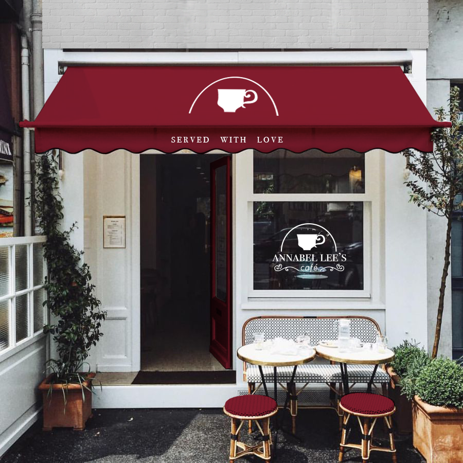
Annabel Lee’s Cafe
Assignment: Use an American author to influence the branding of a restaurant. Use this branding guide to create a brand that is consistent and cohesive.
Annabel Lee’s is a cafe centering around a welcoming and warm environment. They combine fresh, local produce and international flavors to transport you to a place where cultures meet. Inspired by Edgar Allen Poe’s poem Annabel Lee, they wanted to evoke an aged and antique feel.
The Combination Mark above is the primary element of Annabel Lee’s Branding Guide and must appear on all official Annabel Lee’s communications. It may only be modified in color according to the color guidelines.
Below is the layout of an official Annabel Lee’s menu. The wine red color scheme helps to tie the menu to the other branding elements. There is also the occurring coffee stain in the upper left-hand corners of the inside and outside of the menu. In order to separate the section headings in the menu from the sub-heading there is a red rule which is carried over from the business card.
Dimensions: 12 x 9
COLLATERAL
Right here begins the section of collateral I designed within the brand parameters. You can see the continuation of wine red through the collateral along with their slogan “Served with Love” in a few strategic places of specific collateral items. The logo can be seen alternating between the combination mark and the alternative horizontal logo depending on which material it is used on along with he scale of said item.


